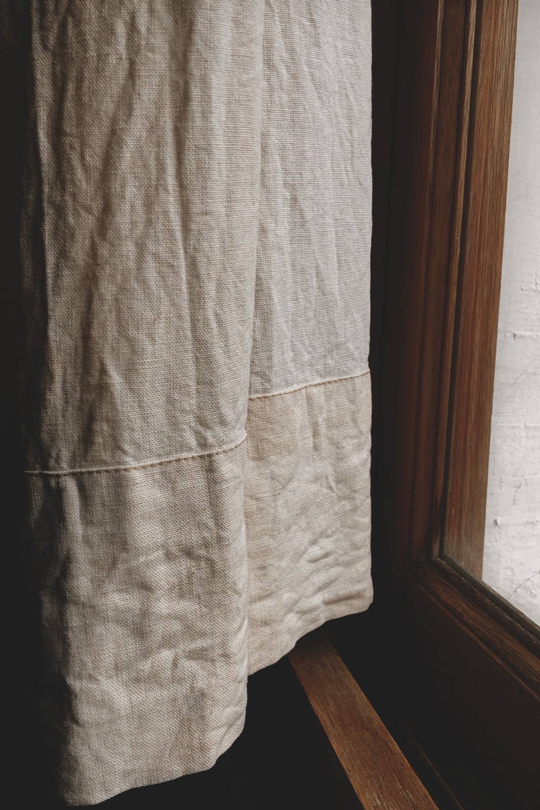
Ask a customer what they want and they'll usually describe a colour, a texture, or a mood: "something soft and neutral" or "linen-looking, but easy to keep clean." What they're actually choosing, whether they realise it or not, is a fibre, and the fibre is what determines whether the curtain will do what they expect once it's hanging. Heading style and lining get most of the attention in a sales conversation, but fabric is the decision underneath both of them.
This guide covers the fabrics that come up most often on a curtain order, what each one is actually good at, and the four properties worth checking before recommending any of them.
Why fabric is the decision underneath every other one
A heading style changes how a curtain gathers at the top. A lining changes what happens behind the face fabric. The face fabric itself changes almost everything else: how the curtain falls from the pole, how much daylight comes through it, how it looks against the wall colour, and how much work it takes to keep clean. Get the fabric wrong and no heading style or lining choice fully corrects for it. A heavy velvet gathered into a dainty pencil pleat looks stiff and lifeless; a lightweight voile stitched into a wave heading that needs weight to hang flat will never sit right.
That's the order worth selling in: fabric first, because it sets the limits, then heading and lining within what the fabric can actually do.
Natural fibre fabrics
Linen
Linen is woven from flax and has a relaxed, slightly irregular texture that customers associate with a natural, unfussy look. It drapes softly rather than falling in crisp folds, filters light rather than blocking it, and creases more visibly than most other fabrics, which some customers read as part of its character and others find untidy. Pure linen is also one of the more expensive natural fabrics and benefits from a lining, since on its own it can look thin and let in more light than a customer expects from a "proper" curtain. A linen-cotton blend keeps much of the texture while reducing both the creasing and the price, and is often the more practical recommendation for a first-time linen buyer.
Cotton
Cotton is the most versatile face fabric in the shop: it takes dye and print well, comes in weights from a lightweight voile to a heavy canvas, and washes and presses more predictably than linen. A plain or printed cotton is usually the right default recommendation when a customer hasn't expressed a strong preference, because it performs reliably across almost every room in the house and sits at a moderate price point. Its main weakness is that unlined cotton can fade with prolonged direct sun exposure faster than a synthetic, which is worth mentioning for a south-facing window.
Silk and silk-look fabrics
Pure silk has a soft sheen and a weight that falls into deep, fluid folds, and it reads as premium in a way few other fabrics do. It is also the most demanding to own: it is sensitive to direct sunlight, which can weaken and discolour the fibre over time, and it generally needs professional dry cleaning rather than a home wash. For most retail customers, a polyester or poly-silk blend "silk-look" fabric delivers most of the visual effect, a comparable drape and sheen, at a fraction of the price and with none of the care restrictions. It's worth being upfront with customers that true silk is a statement choice for a room with limited direct sun, not a practical everyday fabric.
Synthetic and blended fabrics
Polyester
Polyester is the workhorse of curtain fabric. It holds colour and pattern well, resists fading better than most natural fibres, machine washes without the shrinking or creasing risk of cotton or linen, and is usually the least expensive option in any given style. The trade-off is that a lower-grade polyester can look and feel noticeably synthetic, with a slight sheen and a stiffer hand than a natural fibre. The quality range within "polyester" is wide, and showing a customer a good polyester next to a poor one, rather than describing the difference, is usually the fastest way to justify a step up in price.
Velvet
Velvet, whether cotton, synthetic, or a blend, has a dense pile that gives it genuine weight, excellent light-blocking and sound-dampening properties, and a look that reads as formal and substantial. It suits bedrooms, media rooms, and formal living rooms particularly well, and pairs naturally with simpler heading styles, since the fabric itself is already visually heavy. Velvet is more expensive to make up than most fabrics because of the yardage and handling it needs, and it isn't the right recommendation for a bright, airy room where the customer still wants daylight through the curtain when closed.
Chenille and other textured weaves
Chenille and similar heavily textured weaves give a room visual interest without needing a printed pattern, and the texture itself does a reasonable job of disguising everyday wear, pet hair, and light marking between cleans. They tend to be mid-to-heavy weight and sit well in family rooms and living rooms used daily. The main thing to flag to a customer is that a strong texture competes with other patterned elements in the room; a textured chenille works best as the main textile statement, not layered against a patterned sofa or a busy rug.
Four properties to check before recommending anything
Fabric names matter less to the outcome than these four properties, and it's worth running through them with a customer directly rather than assuming the name alone tells them what they need to know.
- Weight and drape. A heavier fabric falls in fuller, more defined folds and holds a heading shape better; a lighter fabric moves more and suits sheer or softly gathered looks. Match the weight to the heading: structured headings like pinch pleat and goblet want body in the fabric, while relaxed headings like eyelet and tab top work with lighter weights too.
- Light and privacy. Every face fabric has a natural light transmission, from a near-transparent voile to an opaque velvet, independent of any lining added behind it. A customer asking for "something bright but still private" is really asking for a mid-weight, tightly woven fabric, not a particular colour.
- Care and durability. Machine-washable versus dry-clean-only, and fade resistance under direct sun, are practical questions a customer should be asked before they fall in love with a swatch, not after the curtains are made and hung.
- Cost per metre, including fullness. As covered in our pricing guide, the finished cost of a fabric depends on its price per metre multiplied by the fullness ratio the heading requires, so two fabrics priced identically per metre can end up far apart in total cost once heading and fullness are factored in.
Matching fabric to the room
A living room generally rewards a fabric with some visual weight and texture, since it's seen in both daylight and lamp light and benefits from depth. A bedroom favours fabrics that pair well with a blackout or thermal lining, covered in our linings guide, since light control usually matters more there than in any other room. A kitchen needs a washable, close-weave fabric for reasons covered in depth in our kitchen curtains guide. A home office or a south-facing room with intense sun exposure should steer away from silk and toward polyester or a tightly woven cotton, since fade resistance matters more there than in a room that gets indirect light.
None of this is a hard rule. It's a starting point for the conversation, which is more useful to a customer than a list of fabric names with no context for which one fits their actual window.
Fabric mistakes that cost retailers the sale, or the return
- Letting the customer choose on colour alone. A fabric can be exactly the right colour and completely wrong for the room's light exposure, cleaning needs, or heading style. Asking about those three things before showing swatches avoids a return later.
- Underselling the difference between fabric grades. A customer comparing two polyesters by price alone, without seeing them side by side, will usually pick the cheaper one and be disappointed by how it looks once made up.
- Recommending silk or pure linen without a care conversation. Both fabrics are genuinely premium choices, but a customer who wasn't warned about sun sensitivity or dry cleaning will blame the retailer, not the fabric, when the issue shows up.
- Not accounting for pattern scale on heavy, structured headings. A large pattern repeat can look completely different once it's gathered into a pinch pleat or goblet heading than it did flat on the roll. Walk a customer through what the repeat will look like gathered, not just unrolled.
Why fabric is the hardest thing to sell from a swatch
A small swatch shows colour and texture reasonably well, but it can't show drape, and drape is exactly what separates a fabric that looks beautiful in the hand from one that disappoints once it's hanging in six-metre folds. A heavy textured weave that feels substantial as a ten-centimetre square can look overwhelming across a full window, and a delicate sheer that looks almost see-through as a swatch can read as perfectly adequate once it's layered into fuller folds.
Showing the customer their actual fabric choice rendered at full scale, in their own window, in their own light, closes that gap directly. It turns "I think this will look right" into "I can see this looks right," which is a meaningfully easier conversation to close, and one that leaves far less room for the kind of disappointment that leads to a return.
Show the real fabric, in the real window
Generate a photorealistic preview of any fabric, hung at full scale, in the customer's own room. 10 free credits included, no credit card needed.
Get Started Free