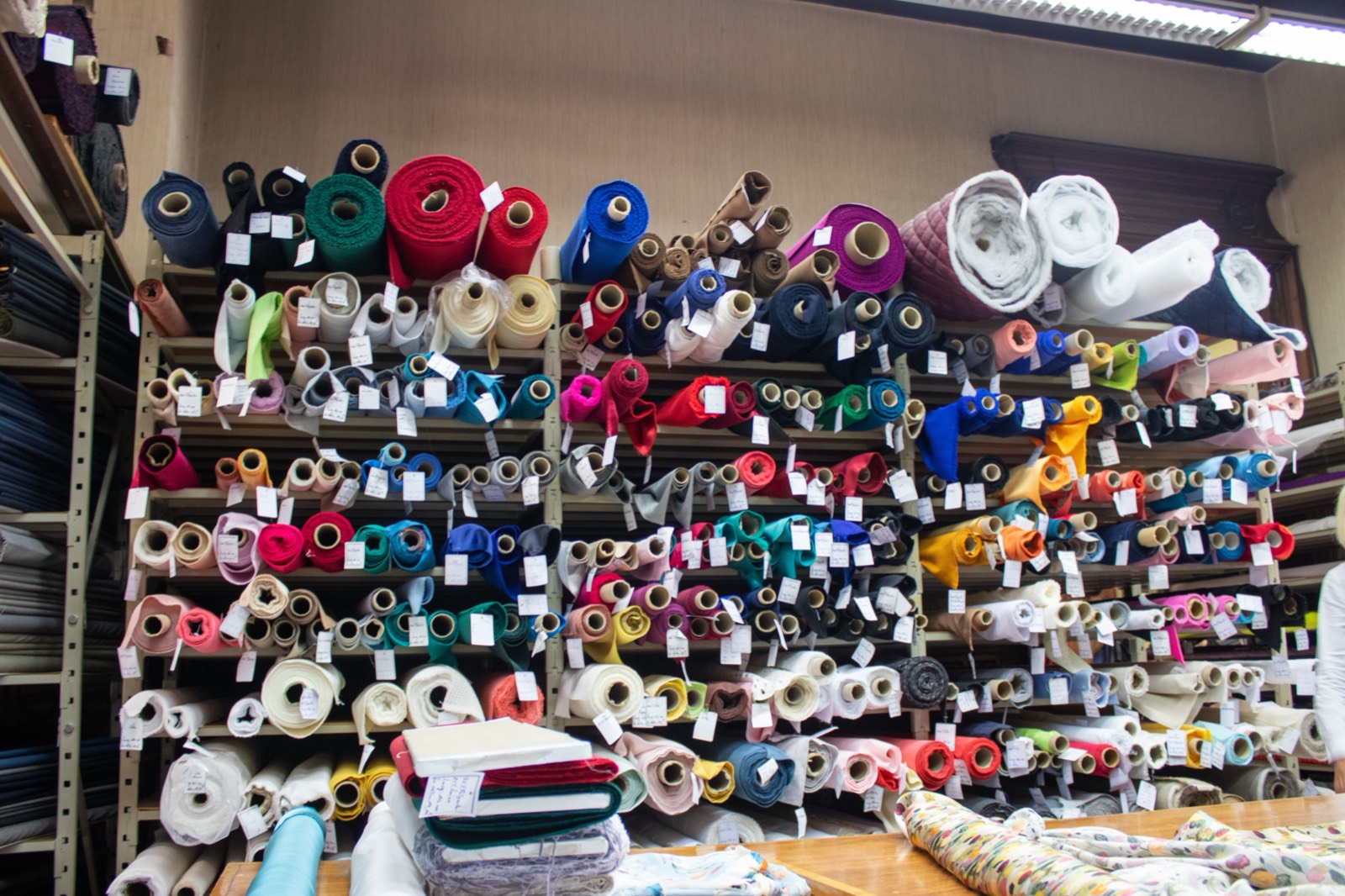
A customer walking into a curtain or blind showroom for the first time is not browsing the way they browse online. They don't know what they're looking for yet, they can't filter by colour or price, and they're forming an opinion about whether this is "a shop that knows what it's doing" within the first thirty seconds. That opinion is set almost entirely by the layout, not by the quality of the fabric on the back wall.
Most independent retailers never deliberately design their floor. The layout accretes over years: a new fabric rail gets wedged in wherever there's space, hardware samples live in a drawer because nobody got round to mounting a board, and the one thing every customer actually wants to see, what the finished product looks like in a real room, is nowhere on the shop floor at all. This guide walks through how to zone a showroom properly, display stock the way customers actually evaluate it, and fix the merchandising mistakes that quietly cost sales.
Zone the floor by buying stage, not by product category
The instinct is to organise a showroom the way a warehouse is organised: curtains over here, blinds over there, hardware in its own section. That makes sense for stock control. It makes no sense for a customer, because nobody walks in wanting "curtains" in the abstract. They walk in at a specific stage of a decision, and the floor should be arranged around those stages, not around your supplier catalogue.
A showroom that converts well generally has three zones, encountered in this order:
- Inspiration zone, near the entrance. This is where a browsing customer, who may not yet know they want curtains at all, gets pulled in. It should show finished looks, not raw materials: a styled window vignette, a lifestyle photo, a "before and after" board. Fabric on a roll tells a browser nothing. A styled window tells them what their own room could look like.
- Comparison zone, in the middle of the floor. Once a customer has decided they're interested, they need to compare: heading styles side by side, fabric weights against light, blind mechanisms they can operate by hand. This is where swatch books, cut-length samples, and working blind demonstrators belong, because this is the stage where customers are narrowing down options rather than being inspired.
- Decision zone, near the consultation desk. The last stretch before a customer sits down to discuss a quote should reinforce the decision they're leaning towards, not introduce new options that reopen the comparison. Hardware finishes, trims, and tieback options belong here, since these are typically add-ons decided once the main fabric choice is settled.
If your current layout puts hardware by the door and finished-look displays in a back corner nobody reaches, you're running these zones in reverse. It's worth physically walking the route a first-time customer takes and noting what they see, in order, before changing anything else.
Display fabric and hardware the way customers will actually use it
The single most common merchandising error in curtain and blind retail is displaying fabric flat, folded on a shelf or wound on a roll, when the thing a customer is actually trying to picture is how it hangs, gathered, against light. A fabric that looks unremarkable folded on a shelf can look completely different pleated and backlit, and the reverse is just as true: a fabric that looks striking as a flat swatch can disappoint once it's made up.
A few changes make a disproportionate difference here:
- Hang, don't fold, your best-sellers. At least your top twenty or thirty fabrics should be shown as a hanging drop with real fullness, not a flat swatch. This is more work to maintain, but it's the display that actually sells, because it shows the thing the customer is paying for.
- Put a light source behind at least one sheer display. Sheers and voiles are sold almost entirely on how they handle light. A sheer fabric displayed against a solid wall under shop lighting tells a customer nothing about how it will look over their actual window. A simple backlit frame near the sheer section solves this permanently.
- Mount hardware on the wall, operable. Poles, tracks, and rings should be mounted so a customer can slide a curtain ring along a pole or run a track by hand, not laid flat in a tray. People trust hardware more once they've felt it work.
- Group blinds by mechanism, with one of each type working. A roller, a Roman, and a Venetian blind that a customer can actually raise and lower answers more questions in ten seconds than a staff member can answer in two minutes of explanation.
Lighting is the most underrated merchandising tool you own
Fabric colour and texture read completely differently under cool white retail lighting than they will under the customer's own living-room lamps or afternoon daylight. This is one of the most common sources of post-sale disappointment: a fabric that looked rich and warm in the shop looks flat and grey once it's hanging at home under a different light temperature.
A showroom doesn't need to replicate every lighting condition, but it should offer more than one. A simple, affordable fix is to set up one display area with warm, dimmable lighting (roughly 2700K, similar to a living room lamp) next to the main shop lighting, and actively invite customers to look at their shortlisted fabric under both. This single habit, built into how staff present fabric rather than left to the customer to discover, cuts colour-related complaints and remakes.
What belongs near the consultation desk, and what doesn't
The area where a customer sits down to discuss measurements and a quote is prime merchandising real estate, but it's frequently wasted on paperwork storage or treated as purely administrative space. Two things work well here, and one thing should be kept well away from it.
Worth having within reach of the desk: a small, curated selection of hardware finishes and trims for quick upsell decisions once the main fabric is agreed, and a tablet or laptop set up for visualization, so the customer can see their actual window with the fabric they've chosen before they commit to a quote. Both of these work because they support a decision that's already 80% made rather than reopening it.
What doesn't belong here: a wall of competing fabric options. By the time a customer is at the desk, more choice reads as doubt, not opportunity, and re-introduces the comparison stage you want to have already finished in the middle of the floor.
Merchandising mistakes that quietly cost sales
- No clear path through the shop. If a customer can enter and immediately see the whole inventory at once, there's no journey, no narrowing down, and no sense of guided discovery. A showroom should reveal itself in stages.
- Discontinued stock left on display. Nothing undermines trust faster than a customer falling for a fabric a staff member then has to say is no longer available. Audit the floor against current supplier ranges at least twice a year.
- Dusty or faded demonstration pieces. Display fabric that's been under shop lighting for two years fades. If it's been there since the fit-out, it no longer represents the actual product.
- No seasonal rotation. A showroom that looks identical in January and July misses an easy, low-cost reason for returning customers to look again. Rotating the inspiration zone seasonally (lighter fabrics and sheers in spring and summer, heavier interlined curtains and blackout options into autumn) keeps the floor feeling current and gives staff a natural reason to start a seasonal conversation.
- Treating the showroom as a warehouse with a till. If the only organising principle is "where there was space," it will always feel that way to a customer, even if they can't articulate why.
Where a visualizer fits once the customer leaves the showroom
Good merchandising solves the problem of showing fabric, texture, and hardware in person. It doesn't solve the harder problem: the customer still has to imagine all of that in their own room, at home, often days after the visit, when the memory of how the fabric looked under your lighting has already faded.
This is the gap a room visualizer closes, and it works best as a continuation of the in-store experience rather than a replacement for it. A customer who has felt the fabric and watched a blind mechanism work in your showroom, then leaves with a photo-realistic image of that exact fabric hanging in their own living room, is in a far stronger position to say yes than one who left with only a swatch and a memory. It also solves the lighting problem from a different angle: instead of trying to simulate every home's lighting in your shop, the visualization is generated against their actual window and their actual light.
The showroom gets them to trust the product. The visualization gets them to picture it at home. Retailers who treat these as two steps of the same sales process, rather than choosing one over the other, consistently see shorter decision times and fewer "let me think about it" walkouts.
Finish the sale your showroom started
Let customers see your fabric in their own room before they leave. 10 free credits included, no credit card needed.
Get Started Free